|
For my final Tech project I created my own logo. I needed to chose a topic and create a logo for it, using Gravit. It was pretty challenging at the beginning, but after I got a general idea of what I wanted to do, everything kind of formed together. To make my logo I used a polygon as my outline and main source of color. I then typed out each letter individually from the word music and traced them using the pen tool. Note that the only way to adjust letters the way I did is by tracing them. Another challenging thing was adjusting the letter into the polygon without ruining that specific letter. For example, I adjusted the letter C to much that it didn't look like the letter C anymore, and I didn't want that happening. 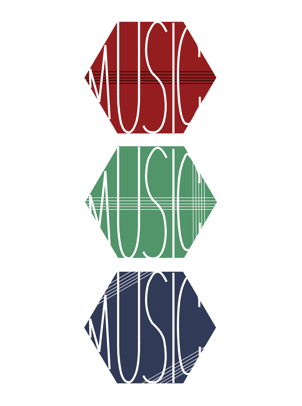 The name of my brand is MUSIC. I picked this topic because music is everything to me. I'm listening to music as I'm writing this. The rhythm is stuck in your head, the lyrics are relatable, and you just want to listen to it all the time. This brand is all about analyzing music. It's a website that includes almost every song in the world. It explores the lyrics and their meaning, the chords played by the instruments and how that matches/fits the lyrics. It's a brand that teaches you all about the power of music and how it's a way for people to express themselves without having to speak. I think that these logos represents that, because it includes different shapes, colors, and different sizes of lines to represent the range of music out there. Between punk, rock, pop, etc. anything is possible. The reason I added five lines in different angles/positions is because we read music notes on five lines. 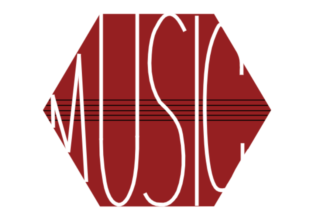
0 Comments
Leave a Reply. |
Archives
January 2021
Categories
All
|

