|
For my final Tech project I created my own logo. I needed to chose a topic and create a logo for it, using Gravit. It was pretty challenging at the beginning, but after I got a general idea of what I wanted to do, everything kind of formed together. To make my logo I used a polygon as my outline and main source of color. I then typed out each letter individually from the word music and traced them using the pen tool. Note that the only way to adjust letters the way I did is by tracing them. Another challenging thing was adjusting the letter into the polygon without ruining that specific letter. For example, I adjusted the letter C to much that it didn't look like the letter C anymore, and I didn't want that happening. 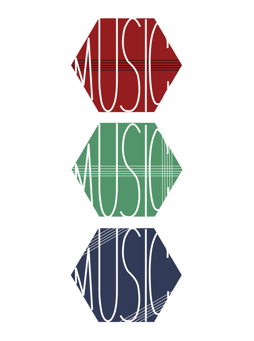 The name of my brand is MUSIC. I picked this topic because music is everything to me. I'm listening to music as I'm writing this. The rhythm is stuck in your head, the lyrics are relatable, and you just want to listen to it all the time. This brand is all about analyzing music. It's a website that includes almost every song in the world. It explores the lyrics and their meaning, the chords played by the instruments and how that matches/fits the lyrics. It's a brand that teaches you all about the power of music and how it's a way for people to express themselves without having to speak. I think that these logos represents that, because it includes different shapes, colors, and different sizes of lines to represent the range of music out there. Between punk, rock, pop, etc. anything is possible. The reason I added five lines in different angles/positions is because we read music notes on five lines. 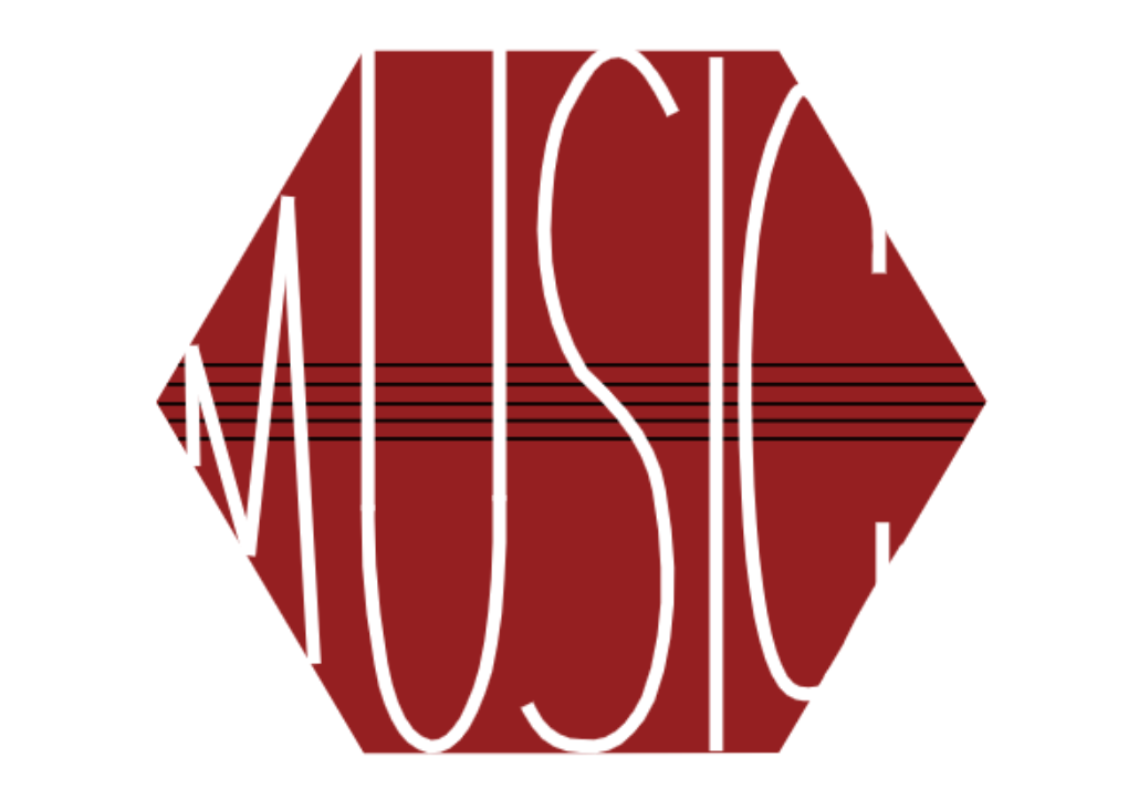
0 Comments
This is one of the last summatives for this year! For the two assignments below I learned all about Color Theory. How RGB (red, green, blue) are primary colors and that yellow, magenta, and cyan are secondary colors. Mixing RGB colors can create an color in the world. I also learned about complementary colors. That was my inspiration for my first assignment, Color Names. The three vertical lines start at one color and slowly transition to their complementary color. For example; green to red. My second assignment was all about color schemes. I learned what Monochromatic, Analogous, Complementary, and Triadic are all about. I hope you enjoy my work. Color Names Color Schemes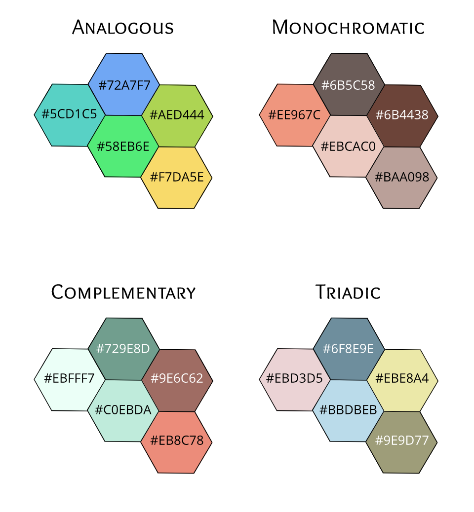 Typography is the arrangement of text which makes the writing readable and appealing. Typography is important because what is the point of writing if its not readable? It's also important because if its not appealing to the reader then why would they stop to read it. I think that the quote “Each font has a personality and a purpose.” means that not every font or format matches every text. For example, you shouldn't put a serious message in a comic san font because then it's hard to take the message seriously. In class we learned about 5 fonts: Serif, San Serif, Monospaced, and Handwritten. Serif is used in large blocks of text, the have "feet," and they are used in print. San Serif are great for headlines, titles, and smaller blocks of text, they are used on the web, and do not have "feet". Monospaced is used in coding, each letter takes the same amount of space, and they do not work well for larger blocks of text. Lastly, handwritten is good for logos or large headlines, its cursive/calligraphy, but it is sometimes hard to read. Typeface ComparisonThis is the first assignment I did for the typography unit. I used the 5 types of typeface to show there difference. 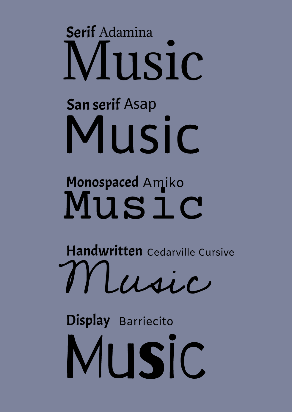 Word PortraitFor this assignment, I picked 10 fonts and wrote words that fit to that font on the right, and words that don't on the left. 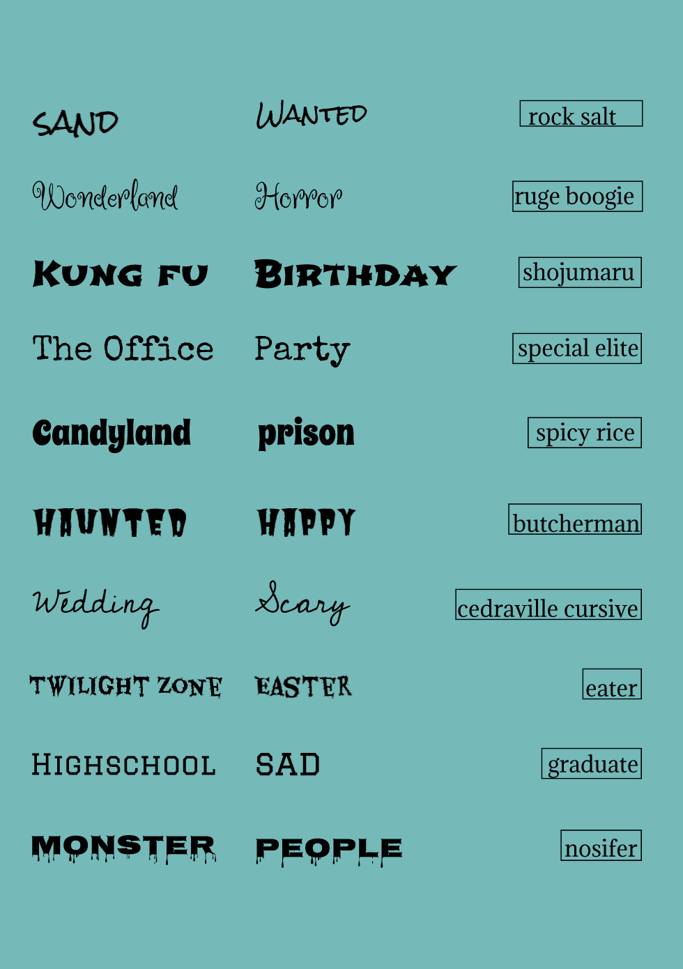 For the past few classes, I have been learning how to use the pen tool. The pen tool is like a drawing tool. It lets you cut out/trace detailed elements. Below is a photo of a superhero exercise. I learned how to use the pen tool to make straight, curved, and corner lines. At first, it was tricky, especially with the spider man icon, but I think it turned out great. The next photo was from a penny assignment. I cut out a more complex shape using two different techniques. This took longer, but looks very professional. The last photo is my summative work. I cut out a tiger, a moon, and I cropped out a background. I also changed the opacity of the tiger so it blends better to the background. Overall, using the pen tool was an interesting and fun process. 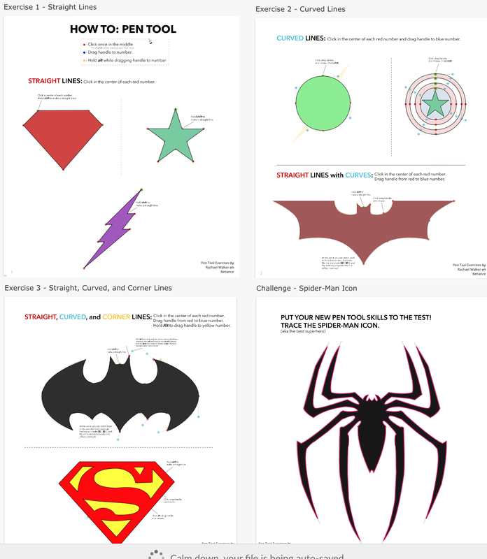 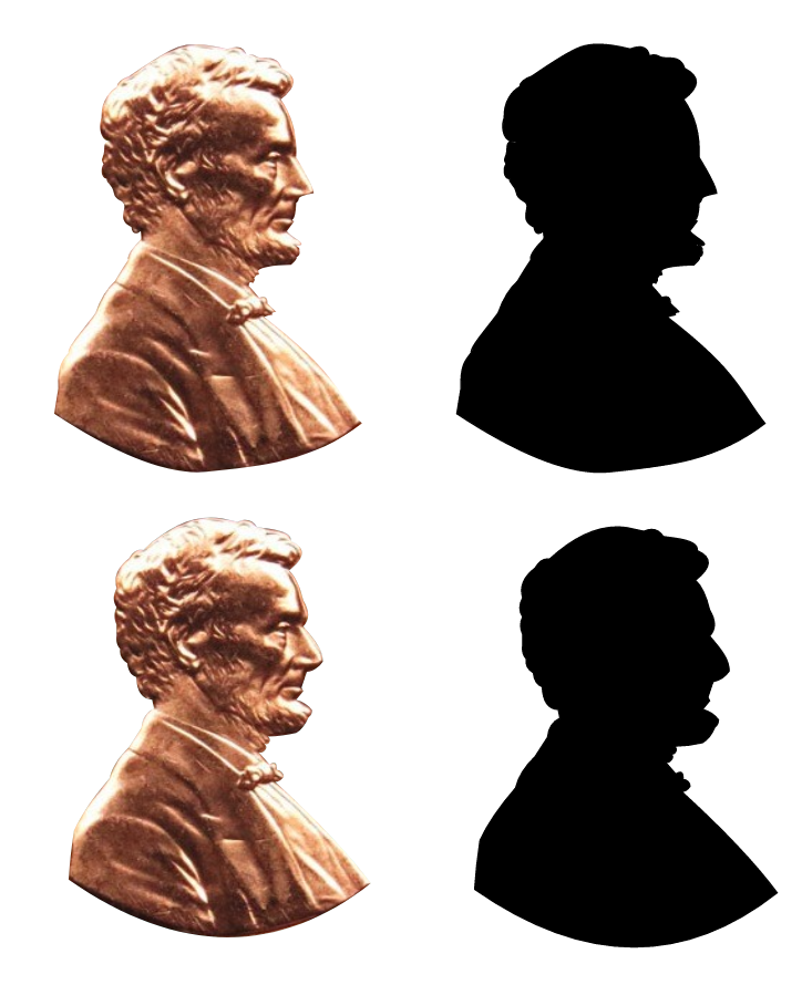 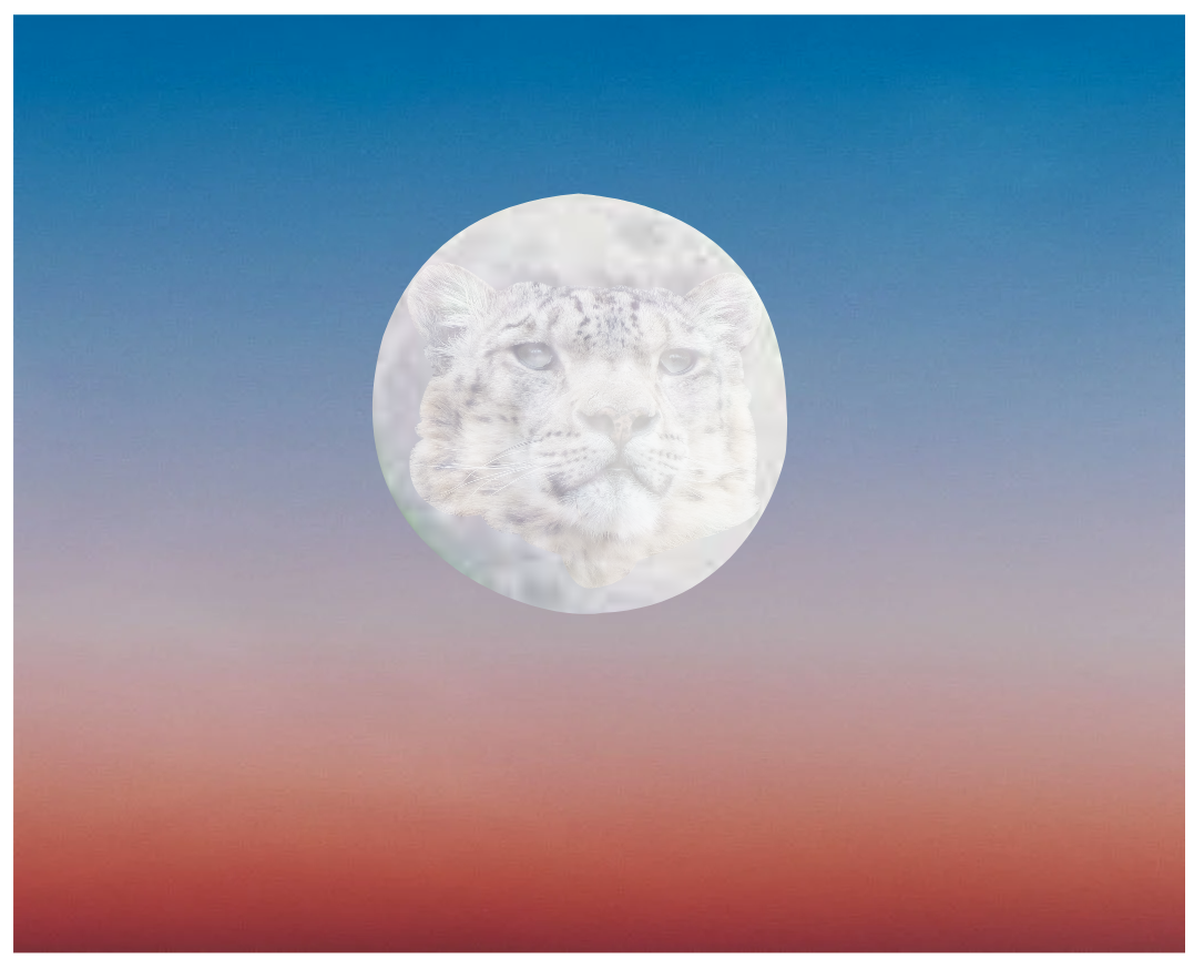 This is my Summative work for working with vector design. I needed to design a photo using only lines, squares, polygons, triangles, ellipses, and stars. There are many reasons to why I decided to design this. Firstly, I love the color of the sky and the stars that shine at us. I also really like traveling and every time I sit in a window seat, I stare at the view. Every time I think of decorating my room I think of the sky and the stars. I was never interested in becoming an astronaut or anything like that, but I just always thought we should appreciate this world. And that is why I decided to design this photo. 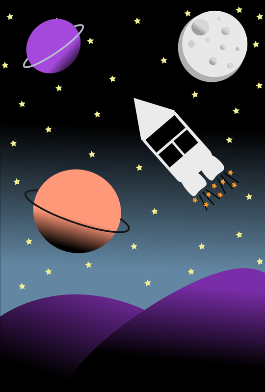 This is the last formative assignment on Gravit. After this, we will have a summative. In this class, I learned about for new buttons. Union, Subtract, intersect, and difference. The words are pretty self explanatory but the four shapes in the bottom of the photo shows how they work. In the first six shapes, I modified the corners, points, and size of a shape. 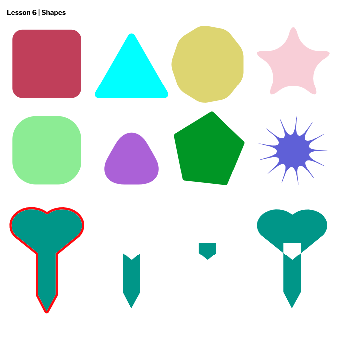 In today's class we used Gravit again. We learned about how the way you layer a series of photos can affect the final look of a project. We also learned that alignment makes your work look neat and grouping makes the process easier. 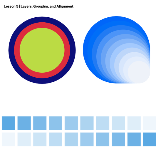 In today's class, we continued to use Gravit to learn about fill and borders. The photo below shows how I used many shapes to change the color of the shape (the fill) and the surrounding pattern (the border). In the bottom right square you will see I have created a series of circles the are aligned and slowly becoming more transparent (or decreasing in opacity). 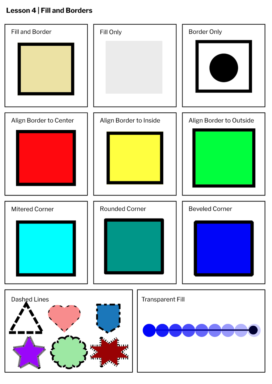 In Tech Class we have been using a program called Gravit. In today's class we created geometrical shapes. We also learned keyboard shortcuts, how to change colors, different pointers, etc. I am getting used to using the site and I am excited to see where it goes. 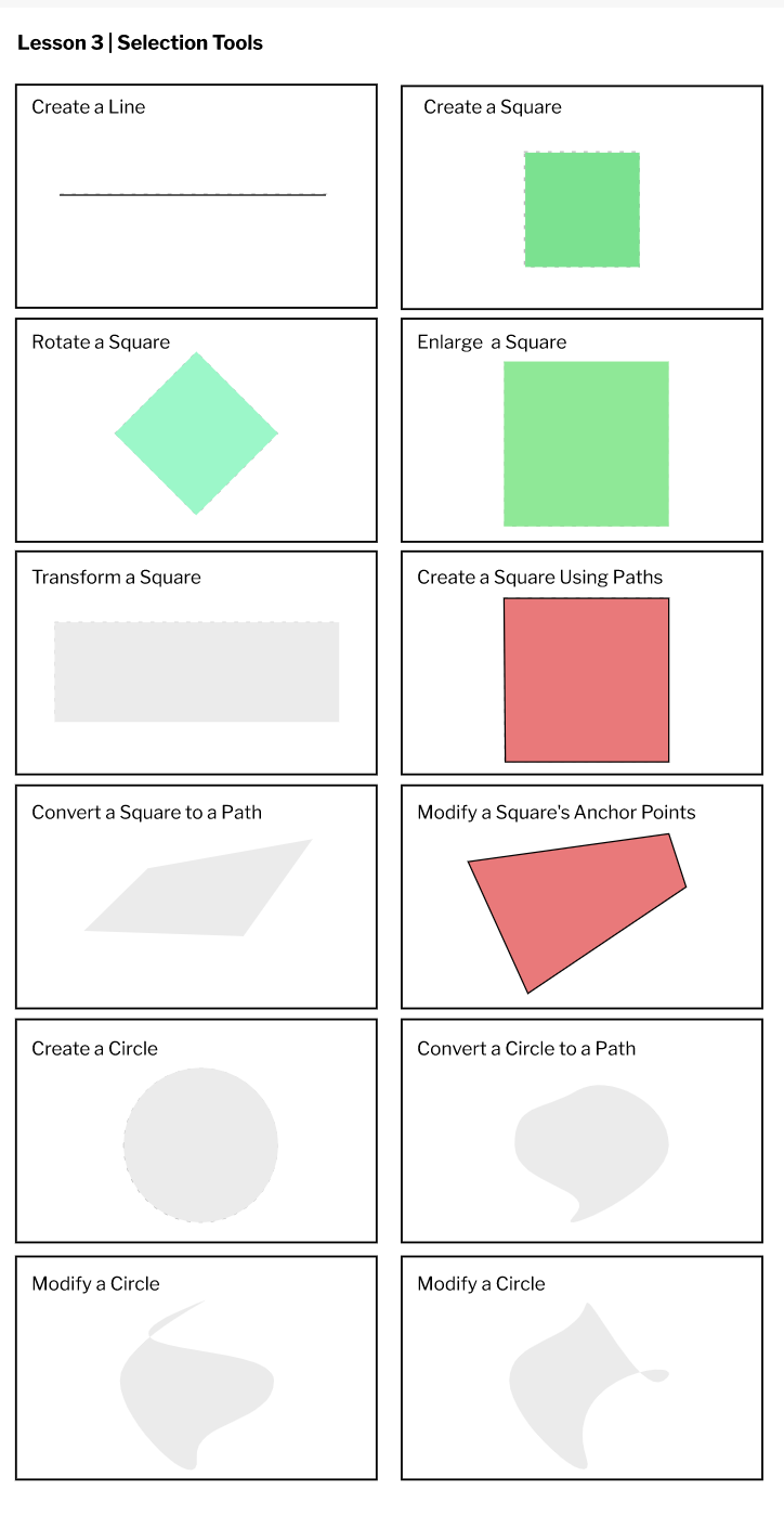 For the past few classes I have been learning about vector design, how it's different from raster, etc. We started off by creating a Gravit account. I'll be honest, logging in was tough and took a lot of work, but we did it. We then watched a quick video tutorial on how to use the website, and started our first assignment. The photo below shows the different sizes pages can be. Obviously, the possibilities are endless, but here is a few. We also learned about two different units, pixels and millimeters. Overall, this was a fun activity. 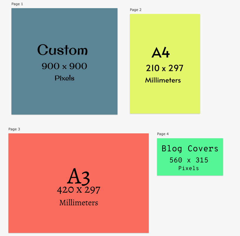 |
Archives
January 2021
Categories
All
|

